Overview #
This documentation was created to help you understand your new website: How it works, all the various pieces that make up the site, where to find things, etc. With this documentation and the corresponding style guide, you will be able to edit existing pages, and create new ones as you continue to add content to build out the site.
Framework
This is a Wordpress website. Wordpress is a Content Management System (CMS), or a platform used to build and maintain a website with the use of a user-friendly interface. This software enables you to customize just about every aspect of your site. With various options, you are able to determine if you want to build using code (HTML editor), or with a WYSIWYG editor. Wordpress powers over 30% of all sites on the internet, making it a leading platform.
Themes
Wordpress sites are powered by themes. Themes allow users to change the look and functionality of a WordPress website without altering the core code or site content. Every WordPress website requires at least one theme to be present and every theme should be designed using WordPress standards with structured PHP and HTML. This website is built using a custom theme called Arena Base Theme.
Plugins
Custom functionality can be created with the use of plugins. Currently there are 55k+ Wordpress plugins available to add the specific functionality you may need. We currently have plugins to assist with everything from form creation, SEO, image sliders, etc. More information on plugins is available in Wordpress section of documentation.
Customizations
With Wordpress and customizations we made to the website, you are able to easily update the site and create new pages. You will notice some pages are as easy as filling out form fields. Once you submit, they are displayed with a specific design. We have separated code from content, allowing you to focus on the content and us the design. These fields are called Advanced Custom Fields (ACF). You will find them on custom page templates.
With the use of page templates and pre-coded custom layouts we have created for the site, you have the tools you need to create new pages.
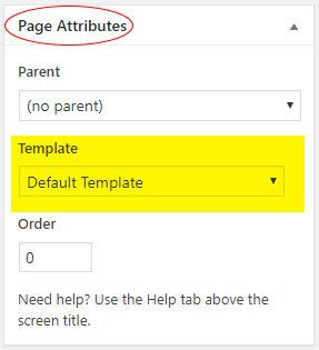
Page Templates
Page templates create the framework or the basic structure of the page. We have created numerous page templates to allow flexibility in creating a variety of pages to accommodate all content needs. All existing pages have a template selected, and the first step in creating a new page is to select a template.
There are a total of 11 page templates created for your site. We have broken them down into standard and custom page templates.
Standard Templates #
These 4 page templates will be your go-to templates when creating new pages and are the most commonly used throughout the website. These templates include: default, two column left spotlight, two column right spotlight, and three column.
Default
The default page template is the simplest layout and has one main content area. You can see the available layouts for the main content section below. Because of the large size of the main content section, most layouts are available for use on this template.
Two Column Right Spotlight
This template includes a main content area, and a larger right column to feature additional content. You can see the available layouts for each of the content areas below.
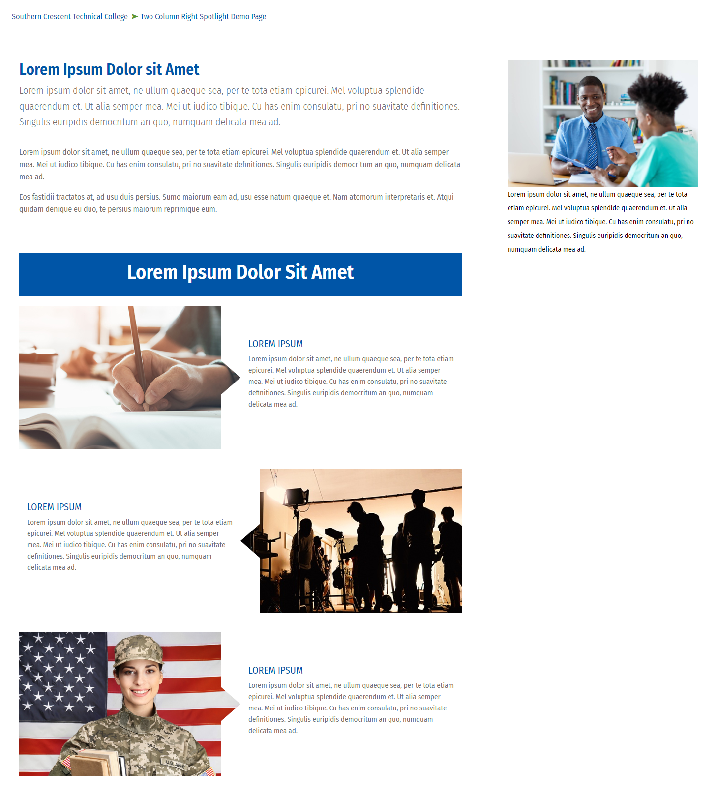
Main content available layouts
Right column available layouts
Two Column Left Spotlight
This template includes a main content area, and a smaller left column, which is most commonly used for a secondary navigation block. You can see the available layouts for each of the sections below.
Main content available layouts
Left column available layouts
Three Column
This template has a left column, a main content area, and a right column. You can see the available layouts for each of the sections below.
Left column available layouts
- A. HTML Block
- B. Content Block
- G. Secondary Navigation
Main content available layouts
Right column available layouts
Custom Templates #
These page templates were created specifically for pages with highly custom layouts (homepage, programs landing page, styleguide, etc.) While you will see them as template options, you should have no need to select one of these templates, unless you are copying one of these pages.
Programs Templates
These templates were created specifically for the Programs section of the website. They provide a unique layout and custom functionality that allow ease of use when creating new programs pages. Because they are a template, they also create uniformity and consistency to keep all program listings the same.
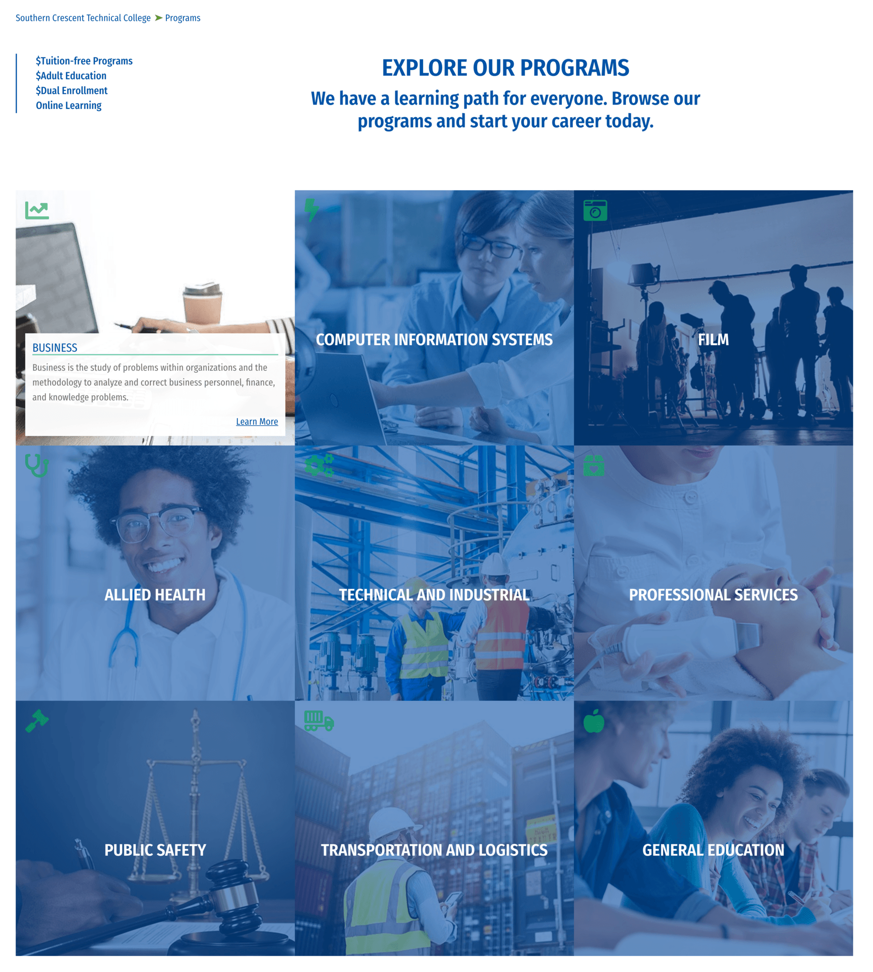
Available layouts
This template is designed to highlight the program categories in a user friendly/interactive way. On the backend of the Featured Program Template there are two required fields that need to be filled in: the header and the description fields. These fields will be display centered at the top of the page, along with the programs navigation, which appears on the left hand side of the page (this nav is automatically added via code at the template level). The remainder of the Featured Program Template is designed to be built with the Program Cards layout (only available on this page). There is also an option to add additional content above or below the Program Cards layout via a Content or HTML Block.
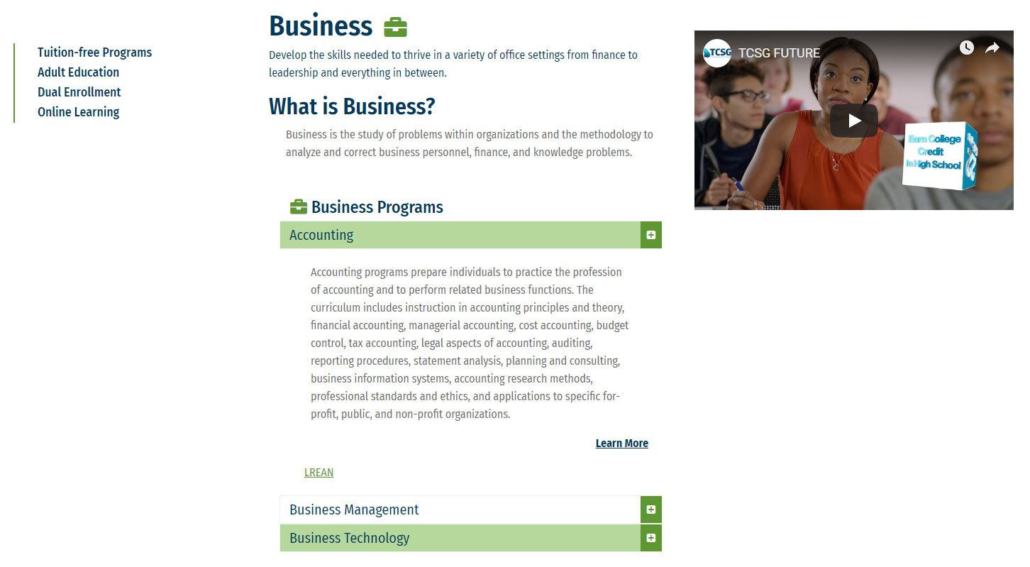
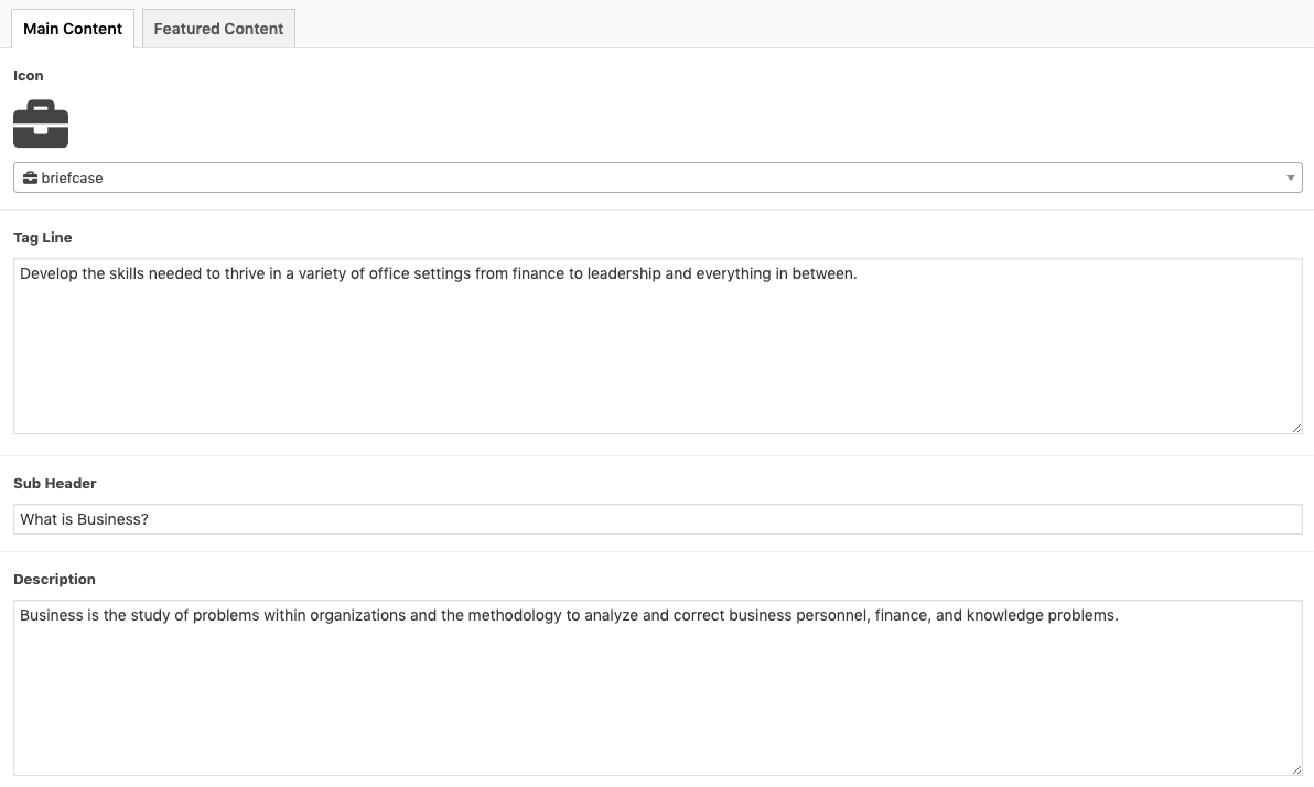
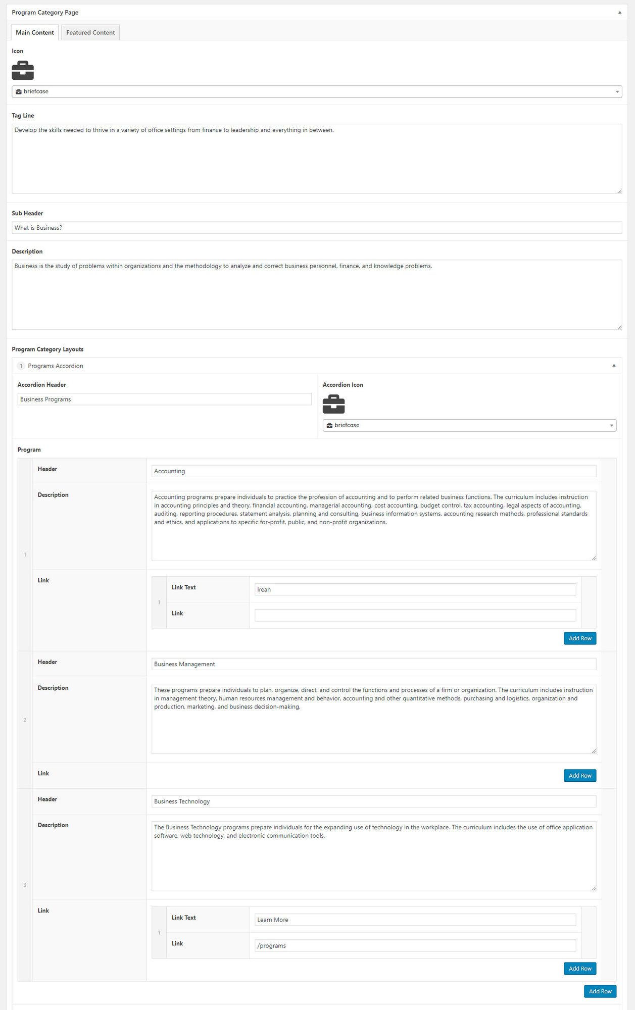
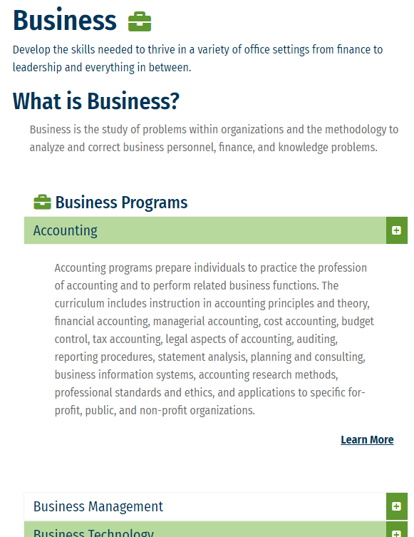
This template is designed to give more detailed information about each program category and list out the relevant programs for each category. The page is split into 3 columns: the programs nav on the left side (this nav is automatically added via code at the template level); the main content area, which contains 4 required fields on the backend (icon, tag line, sub header, and description) and the option to add 3 layouts; and finally the featured content area which displays on the right side of the page.
The required fields in the main content area display as follows:
- Page Icon: displays next to page header which is auto-generated. These icons are pulled from Font Awesome Pro. You can search for a relevant icon right on the page.
- Tagline: displays under the page header. Functions as a description of each program
- Sub-header and description: display directly underneath the main page header. Functions as an area for more descriptive general information.
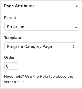
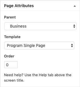
NOTE: These pages are a child of the Program page, which means the parent page needs to be set under the page attributes menu on the right side (ex. The Programs Page (Featured Programs Page Template) is the parent page of the Business page (Program Category Template). The parent relationship is important in the auto-creation of breadcrumbs.
Main content available layouts
Right column available layouts
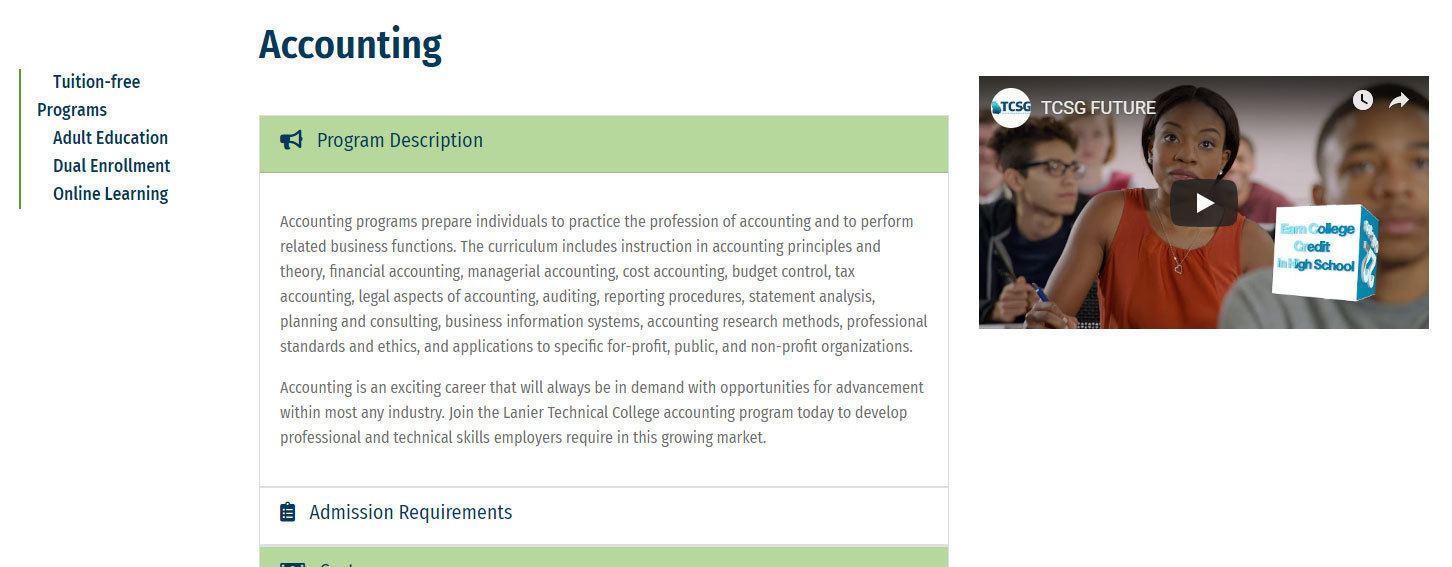
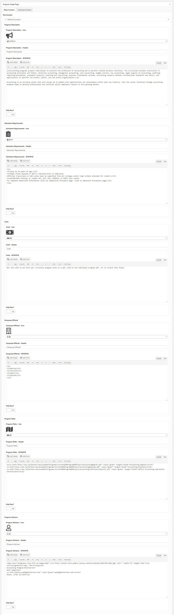
This template is designed to give detailed information about specific details of each program. The page is split into 3 columns: the programs nav on the left side (this nav is automatically added via code at the template level); the main content area, which contains the default accordion layout (used as a pre-populated starter layout), as well as a few other layout options; and finally the featured content area, which displays on the right side of the page.
NOTE: These pages are a child of the [Program Category] page, which means the parent page needs to be set under the page attributes menu on the right side (ex. The Business page (Program Category Template) is the parent page of the Accounting page (Program Single Template).
Main content available layouts
Right column available layouts
Home Page Template
This template was created to build the hompage and should only be used on the homepage. We will review its various layouts to guide how to make edits and keep the site up to date.
How To Edit the Homepage

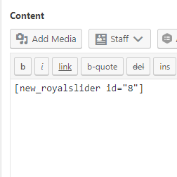
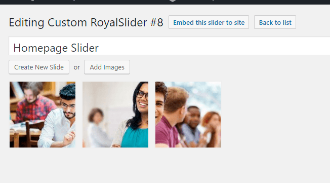
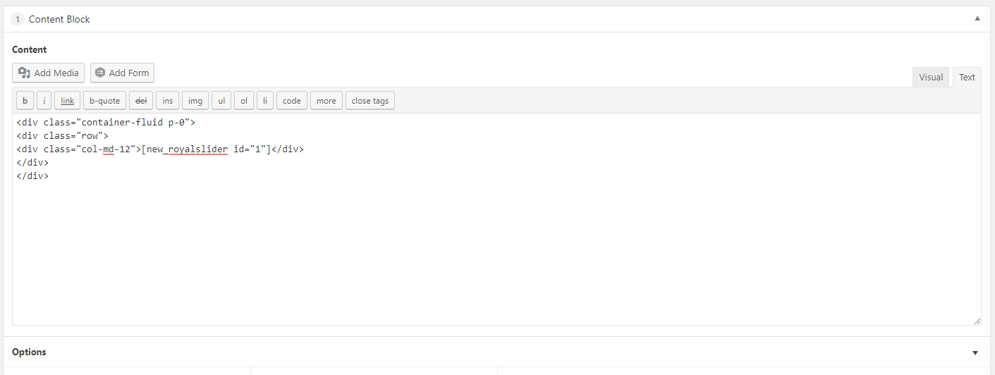
Homepage Slider
The homepage slider uses a plugin called RoyalSlider. The RoyalSlider plugin can be found in the Wordpress menu on the left side of the backend of the website.
To edit the slider navigate to Royal Slider > Edit Slider and select the slider you’d like to edit. This first screen is also where you will find the shortcode to copy and paste onto a page template.

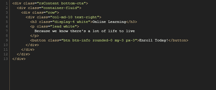
Once you have selected a slider to edit there will be an option to Create New Slide or Add Images (both do the same thing). Once you’ve added an image, click on the image to access the editing options, then click on the "HTML Content" tab.
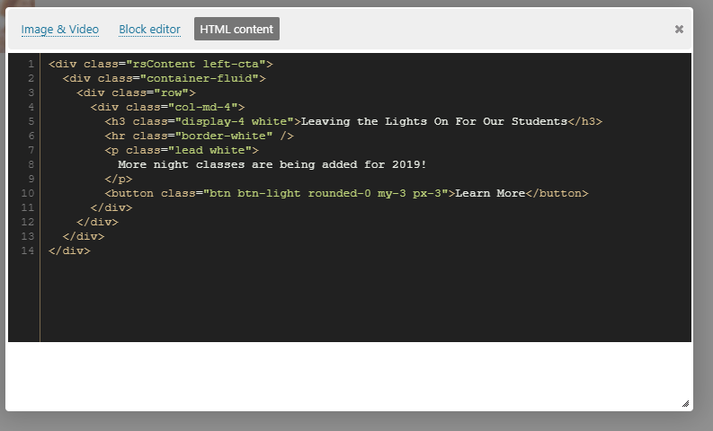
Note: all sliders on the homepage are coded to display with different layouts for variety. These layouts can easily be manipulated with HTML so long as the elements are contained within a div class .rsContent, with the .container-fluid and .row structure inside the block.
See the styleguide for more information and snippets.


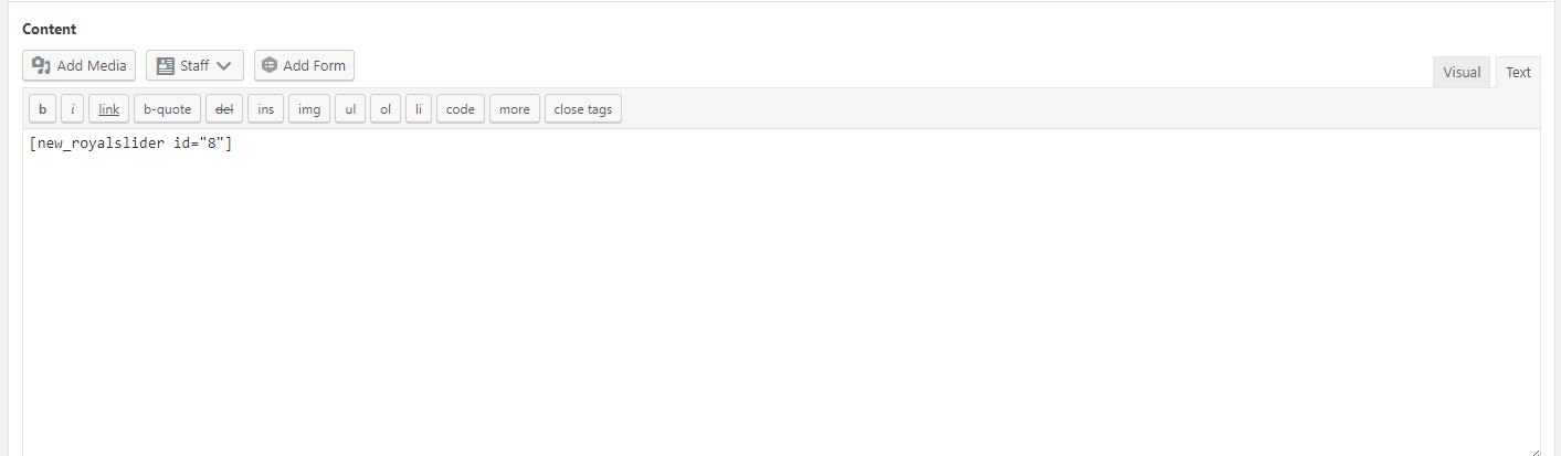
To get the slider to render on a page other than the current homepage, copy and paste the slider shortcode into a content block on that page you wish it to display. The homepage currently has this shortcode in place and can be used as an example for other pages, just make sure to update the slider ID to the correct slider you wish to display.

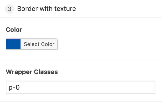
Border with Texture
A border layout that is only found on the Hompage. This layout is used to break up content and provide a visual separation between content. There are horizontal green lines and the default background color is blue, however the color can be changed just keep in mind that the lines will remain green.
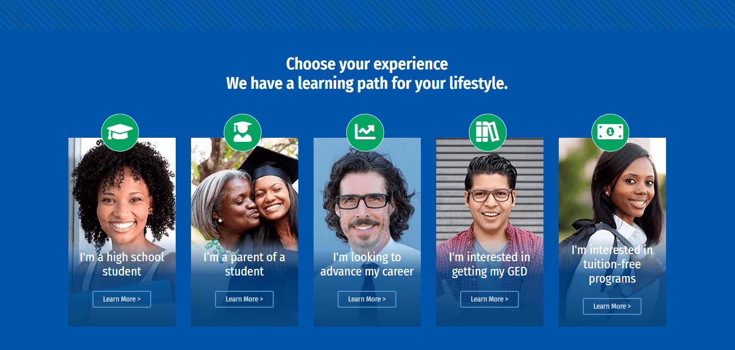
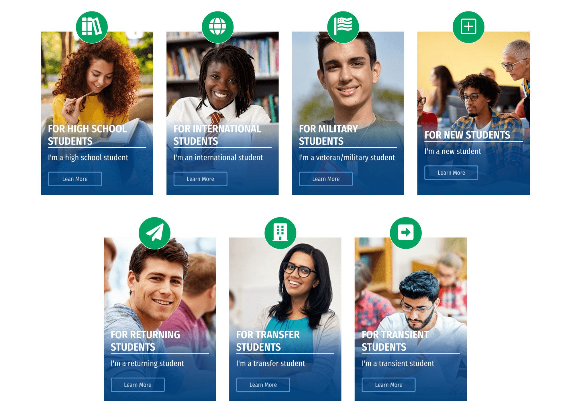
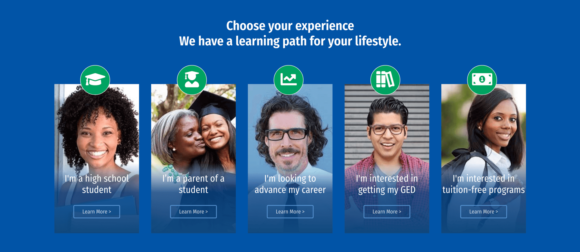
Choose Your Experience
This 5 column card layout is specifically designed for the Homepage and is intended to display 5 cards, no more and no less. There is a similar layout designed for the backpages that allows for umlimited cards. This layout allows for the icons, card text, a button link, and a background image to be customized. There is also a section header that can be added. A blue gradient is added automatically to the card to help with text readability.
NOTE: The icon color, section header and card text color are controlled by the layout options text color field. It is recommended to change this to white for the best results and to add a background color of blue.
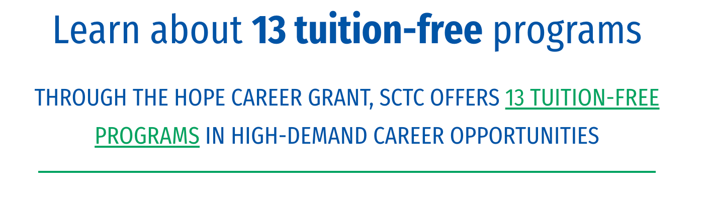
Tuition-Free Header
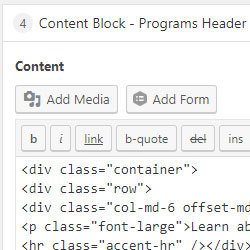
This section was built with a simple Content Block layout and HTML/Bootstrap. This is a good example of how most back page layouts will be built (using a Content Block layout and a code snippet).

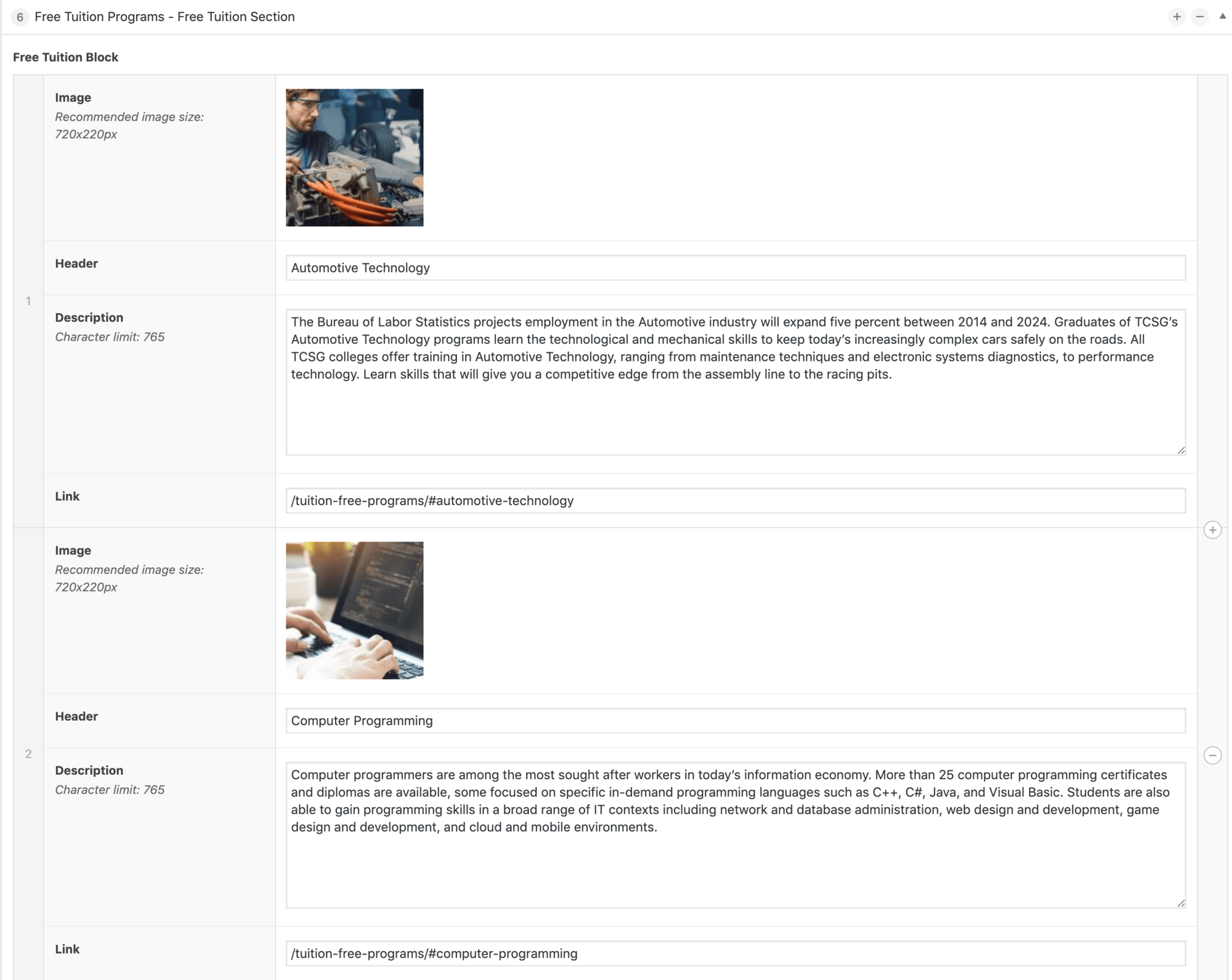
Free Tuition Programs Section
The programs section layout is designed to feature 6 programs at a time and drive user interaction. Hovering over a program image on the right will result in the left box text being updated with more information about that program. All text is customizable on the backend except for the learn more button text. Links and images are also customizable. There is no limit to the number of programs that can be added, however only 6 programs will be displayed at a time. By default the programs will be displayed from top to bottom in order of how they are built on the backend. There is an option to re-order the programs (hover on the left side and drag-and-drop) if certain ones need to be displayed or the randomizer button can be used to display a new set of programs each time the page is loaded.
Features
- Add unlimited programs
- Randomize programs displayed
- Drag and drop programs to re-order
- On hover display more information
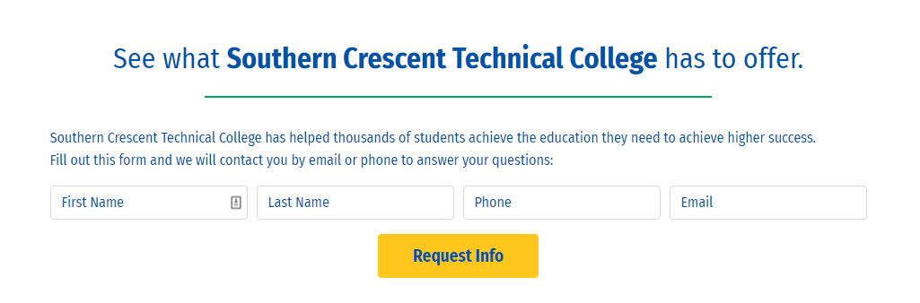
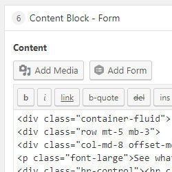
Content Block Form
This section was built with a simple Content Block layout and a shortcode snippet to display the gravity form.
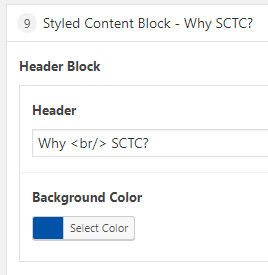
Styled Content Block
The styled content block is a 2 column display. The left column will be a short header, while the right side will be a textarea that displays with a green accent triangle in the left bottom corner. Text color, background color and background image can be customized on this layout in both columns.
NOTE: the height of both columns is determined by the length of the main text.
To use the background color on the right side content make sure to add p-0 to the layout options class field.
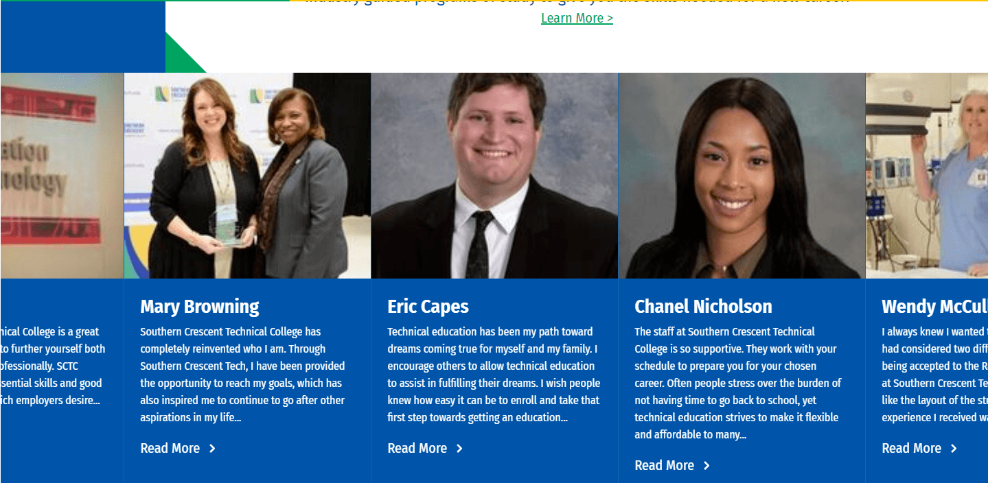
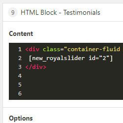
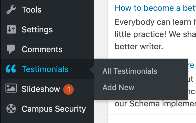
Testimonial Slider
Testimonials are a custom post type and can be found in the Wordpress menu on the backend of the site. Testimonials are added just like the news posts, in a WYSIWYG. There is also an option to add a featured image that will display on the page itself and in the slider on the homepage.
Each testimonal page has custom styles added to them so they are automatically placed in a blue box with a green border around the featured image on the left and the testimonial text to the right with the publish date. The post title will display at the top of each page.
NOTE: the slider will automatically pull a preview of the testimonial text and will add three ellipses to text that is too long. You can customize this text in the excerpt field towards the bottom of the testimonials post page.
After adding a new testimonial, in order for it to show in the slider or on the frontend of the site, you'll need to navigate the the RoyalSlider plugin, open the testimonials slider and re-save the slider.
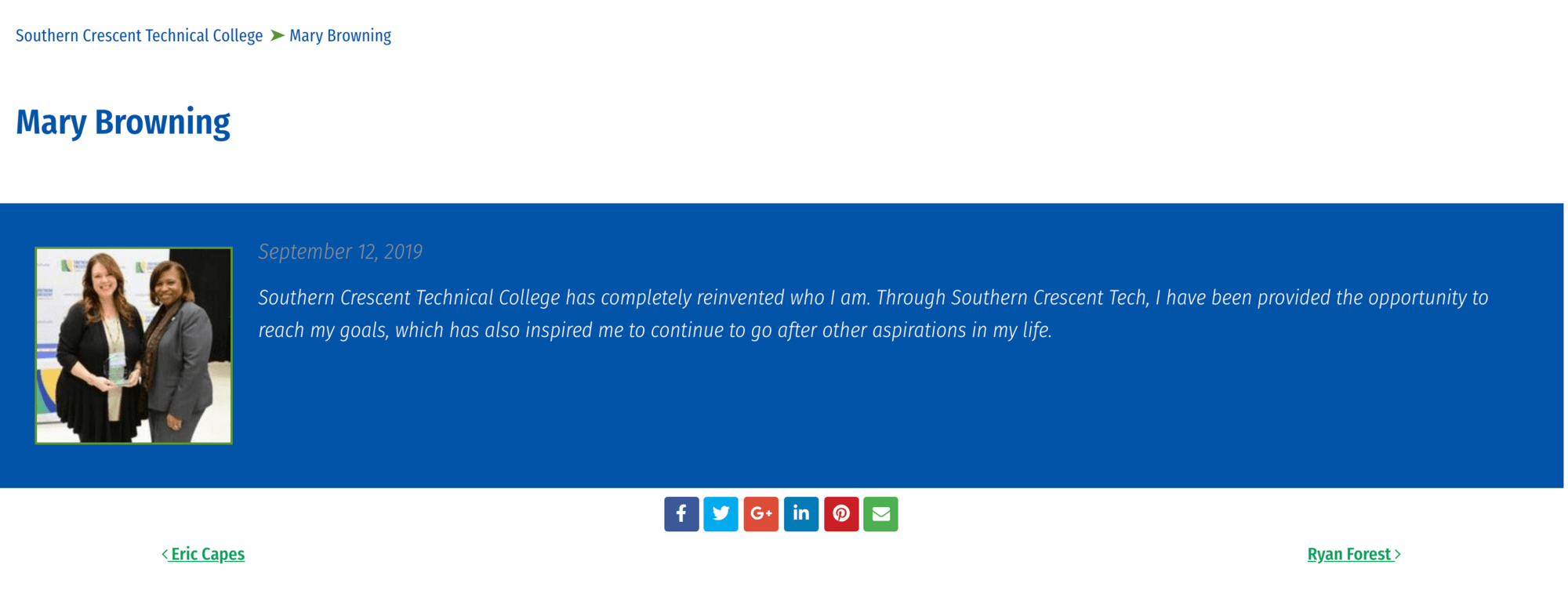
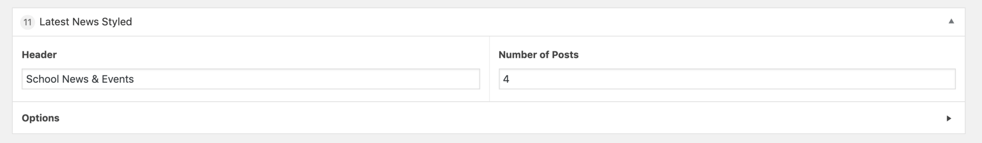
Latest News Styled
The latest news styled layout is an automatically generated feed that displays the latest news articles and is designed to be more interactive than the default latest news layout. The top section will display more information about the cards hovered on below. This section also features an events feed that is populated by The Events Calendar plugin.
NOTE: this layout can be replaced with the latest news layout, which is the default automatically generated news feed. The latest news layout displays in a 3 column card layout.
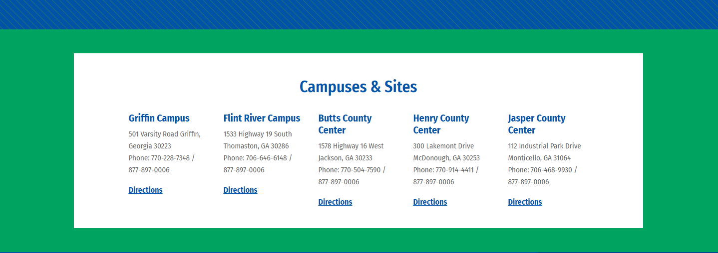

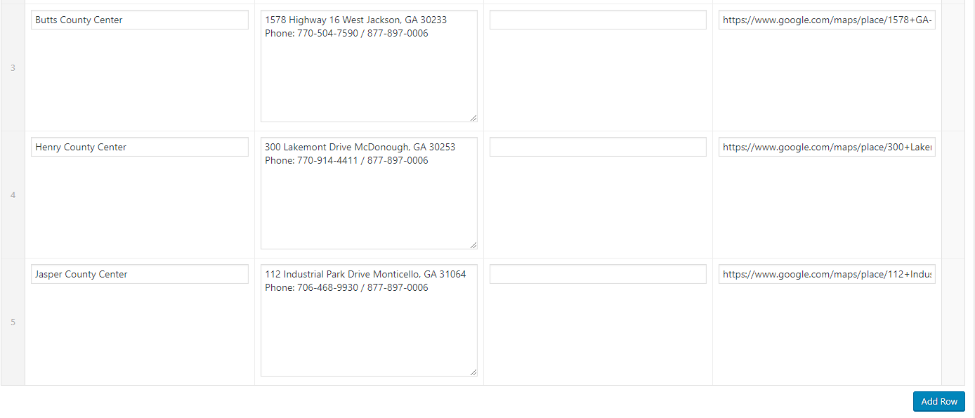
Campus Locations
The campus locations layout is design to have 5 locations displayed at a time however, more locations can be added and will be pushed to the next line (left aligned). The backend has form field to enter:
- campus name
- address
- learn more link
- directions link (google maps)
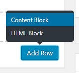
To add a new location simply click the "Add Row" button at the bottom of the campus locations layout.
Reference Templates: Documentation and Styleguide
These specific templates were created for and are to only be used for the Stylguide and Documentation pages.
Page Options
Each page template comes with Page Options, where custom scripts and styles can be added, along with Header options to show, hide, and position the default H1 page header.
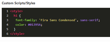
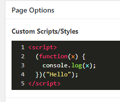
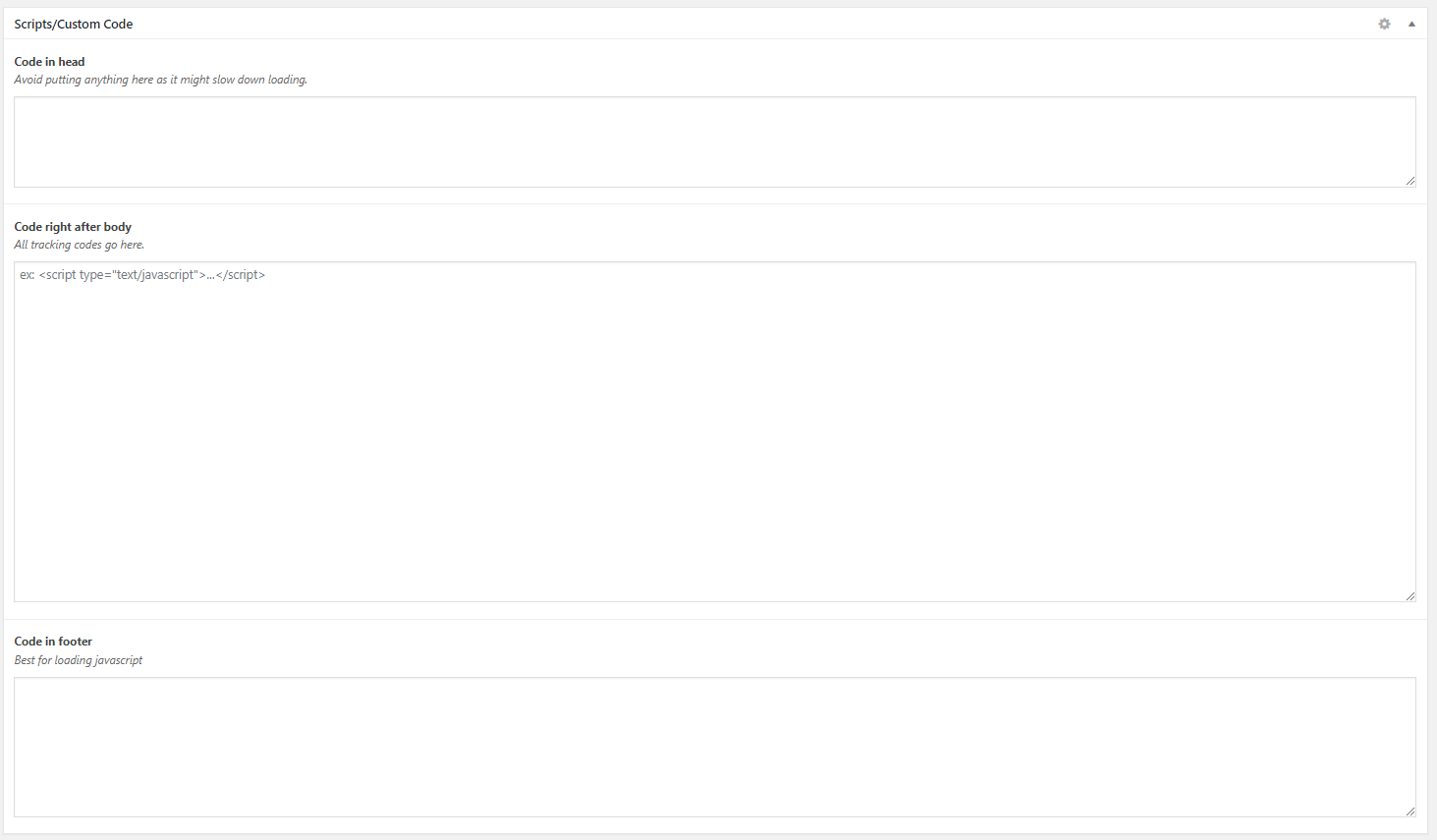
Custom Scripts/Styles
What is it?
Code area where styles or scripts can be added that will only affect the page they're added to. For example, if a color were to be applied to an H1 element on the backend Page Options Custom CSS of /programs/, only the H1 elements of that page will be affected, leaving the rest of the H1 elements on the site untouched.
How to use it
Make sure to wrap your code in opening and closing <style> or <script> tags accordingly. As with working with any code, be sure to properly close lines with curly braces and/or semi-colons to avoid unexpected page behavior.
Where can it be used?
Custom Scripts/Styles are available on every page to provide refined control over the look and functionality of your content.
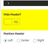
Header Options
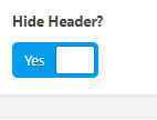
What is it?
Section to control whether the main H1 header of the page is hidden, and how it should be positioned.
How to use it
Hide Header is a simple boolean toggle with a "Yes" or "No" option to show or hide the element, respectively. Position Header is an option to control whether the header is positioned left, right, or center on the page. Note that the Position Header options are not visible if "Hide Header" is set to "Yes."
Where can it be used?
Header Options are available on every page to provide refined control over the look and functionality of your content.
Breadcrumbs

Breadcrumbs will automatically appear at the top of every page and rely on the page attributes (parent-child relationship) to function correctly. Assigning pages a parent page when organizationally necccessary will help with navigation and breadcrumb linking.
Layout Options
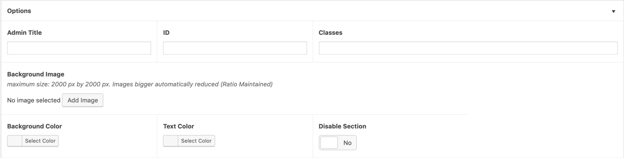
The majority of layouts will have layout options available at the bottom of the layout. These options apply to the layouts outer most wrapper.
- Admin Title (adds a label to the layout header for better organization)
- ID (adds an ID to the outer wrapping container)
- Classes (adds classes to the outer wrapping container, margin and padding are the most commonly added classes in this area)
- Background Image (change layout background image)
- Background Color (change layout background color)
- Text Color (change layout text color)
- Disable Section (hide layout)
Drag & Drop Layouts
Drag to reorderLayout containers and repeating layout rows can be re-ordered with a convenient drag and drop feature. Simply hover over the top of the layout container and the "drag to reorder" arrows will appear. For layout rows hover over the left side of the row where the row number appears.

Add & Remove Layouts
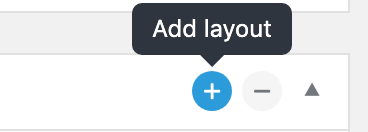
Layouts are added and removed with the plus and minus buttons located in the top right corner of each layout.
Layouts Library
While page templates create the framework and basic structure of pages, layouts are the blocks that contain the content of the page.
Each page template is divided into different content areas or sections. Each section has available layouts for use, depending on the size of each of those sections. We have tested which layouts work best in each of the sections and have taken responsiveness into consideration.
Just like page templates, we have custom layouts and standard layouts. Layouts vary in simplicity from a WYSIWYG editor and an HTML block, to predefined layouts that create the code needed to create a custom layout.
Standard Layouts #
Here you will find all the available layouts for the site. Some layouts are available globally, while some are further limited by page templates, and certain content areas within the templates. You can learn more about where they are available in the page layout section. With each layout comes a set of advanced options where the user may add an Admin Title to add a descriptive name for the layout, ID and Class fields to help with CSS and/or script targeting, Background Image and color to streamline background control, and font color control settings. If this section is ever not needed, there is an option to disable to keep things organized.
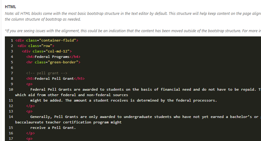
A. HTML Block
Note: all HTML blocks come with the most basic bootstrap structure in the text editor by default. This structure will help keep content on the page aligned, especially on mobile and can be used as starter code. Feel free to modify and update the column structure of bootstrap as needed.
*If you are seeing issues with the alignment, this could be an indication that the content has been moved outside of the bootstrap structure. For more information on how to fix this issue see: Bootstrap documentation.
What is it?
This layout allows you to enter an HTML block/editor into your page to fine-tune your content. This block allows you to insert your code so you can fine-tune your content. It has syntax highlighting for easier coding. This is one of the most basic and commonly used layouts.
How to use it
Once you have added the HTML block layout to your page, you can add your content using HTML. Hypertext Markup Language (HTML), is language used to describe the semantic content of web pages. If you are unfamiliar with HTML, a content block might be a better layout to choose so you can use a WYSIWYG to easily add content. You can learn some HTML basics here.
Where can it be used? All page templates and sections
  <div class="container-fluid">
    <div class="row">
      <div class="col-md-12">
        [Add your content/html here]
      </div>
    </div>
  </div>
B. Content Block
What is it?
The Content Block is a Wysiwyg Editor with options to switch between a visual (rich text) editor and a plain text editor to which HTML markup may be added.
How to use it
This is a versatile block that allows for rich text, plain text with HTML markup, and shortcode placement. Shortcodes can be added in both the rich text and plain text options. The rich text editor is similar to a Word document, where text formatting and media such as images and videos may be added.
Where can it be used? All page templates and sections
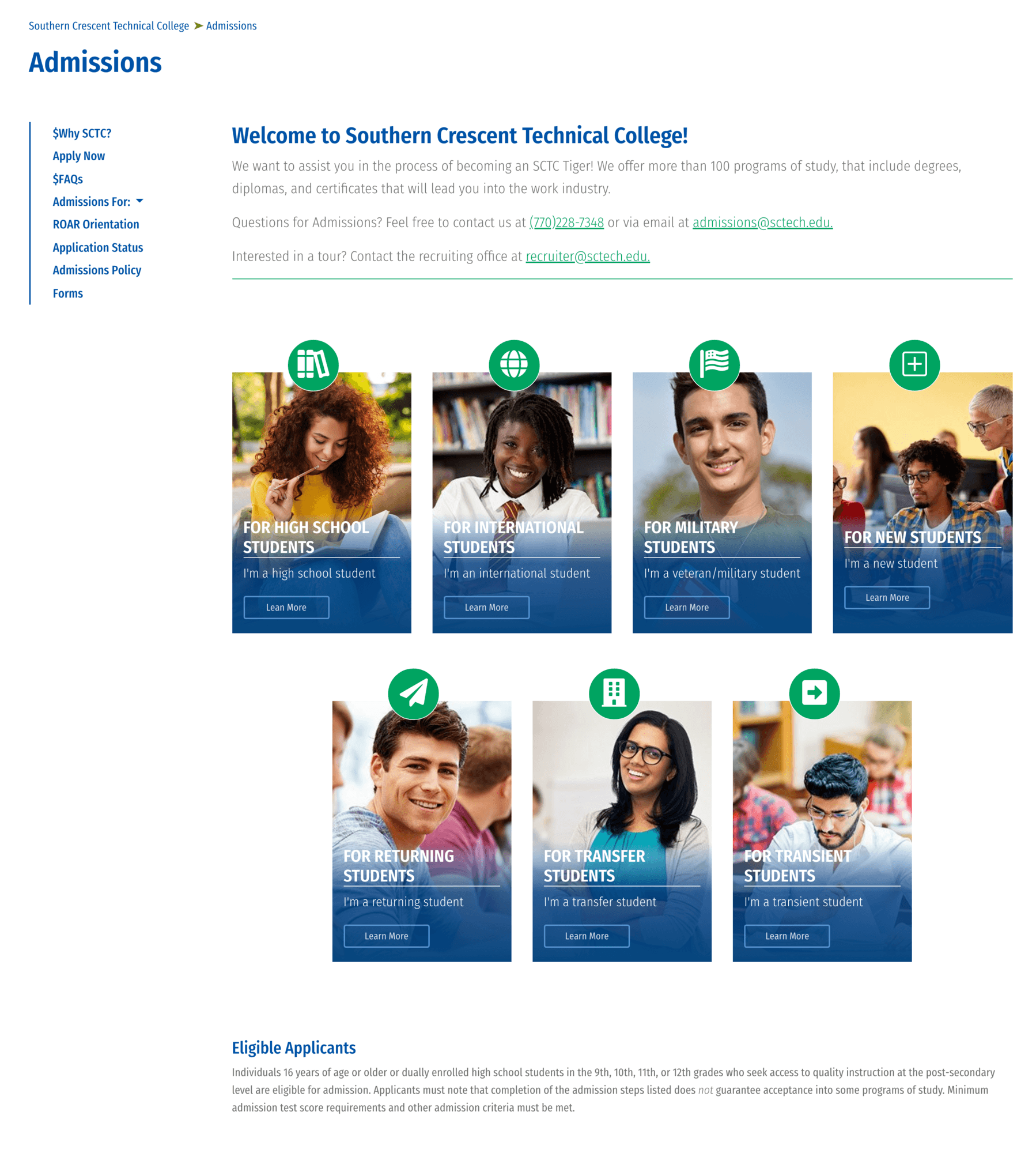
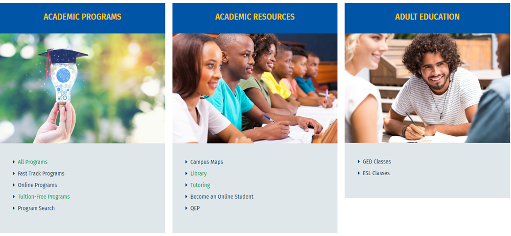
C. Icon Photo Cards
What is it?
This allows you to re-create the below layout, which consists of a card section that includes headers with icons on top, short description, and button. When adding this layout to a compatible section, it displays the required fields to create this layout (selection of icon, photo, link text, etc.). This particular layout allows for unlimited card options.
How to use it
To use, add the desired text and markup (if necessary) and link to the corresponding "Text" and "Link" sections. Each subsequent section will have corresponding fields labeled with numbers up to 5. Then, select an icon from the Font Awesome dropdown menu. There is also an option to select a header, which will add a larger font description with a horizontal rule beneath. It's best to keep this header simple to avoid visually overcrowding the element.
Where can it be used?
Default template, both two column layouts, three column and Choose Your Experience section on home page custom template.
D. Hub Cards
What is it?
Limited to 3 columns, this grid is designed to fill in the extra spaces when the card heights don’t match up. If you’d like the card images to be the same size, all images must be uploaded as the same size. Header links are optional and if left blank, a link will not appear. (Header, link, image, description). There is also an option to open the provided link in a new tab.
How to use it
To use, provide an optional header and/or link, image, and description. The description area is a Wysiwyg which allows for rich text formatting or HTML markup.
Where can it be used?
Default template, two column left spotlight

E. Styled Two-Column
What is it?
Specialty layout that was used to create the tuition-free page, but recreated as a layout option for other pages. This layout is great for featuring information in a visual way, with a click through to another destination. Each row is staggered to show alternating image-description, description-image, to be stacked in image-description order on mobile.
How to use it
To use, provide an image, header, description, and link. Description section is a Wysiwyg editor which allows for rich text formatting or HTML markup.
Where can it be used?
Default template, both two column templates and three column template


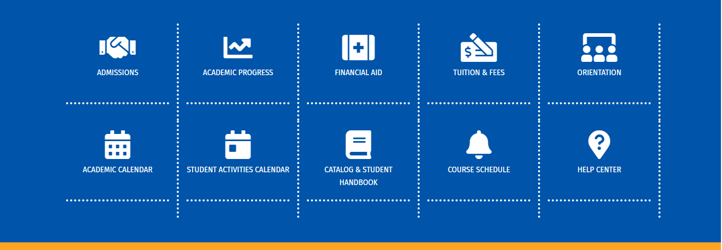
F. Icon Grid
What is it?
Linked icons styled in a 5 column grid. If there are more than 5 icons the next one will be pushed to the next line (left aligned). Option to open the link in a new tab.
How to use it
To use, select the "Icon Grid" layout from the Add Section menu and simply choose an icon from the Font Awesome dropdown menu and provide a link and brief description. If no description is provided, only an icon and green horizontal line with display.
Where can it be used?
Default template, both two column templatea and three column template

Custom Layouts #
Created specifically for the custom page templates. Only needed and used on program templates (H, I, J, R), and the homepage template (K, L, M, N, O, P)
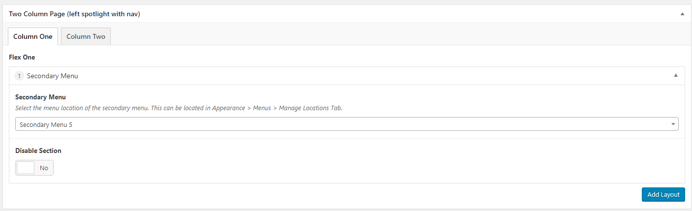
G. Secondary Navigation
What is it?
Section to add left side vertical navigation links.
How to use it
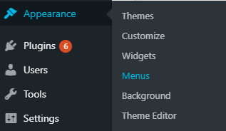
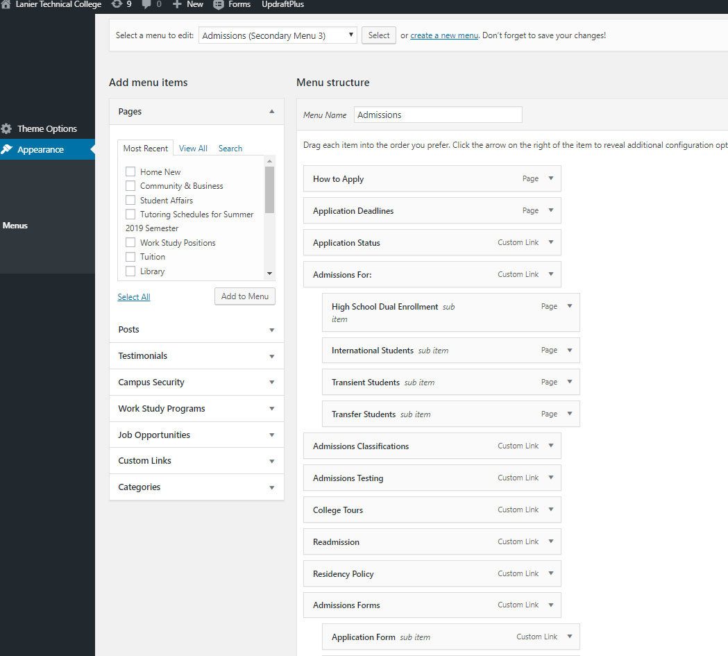
Create a menu by navigating to Appearance>Menus> Create New Menu. On the page that the menu layout is located, select the menu location (This can be located in Appearance > Menus > Manage Locations Tab).
Note: It is not recommended to manage menus through the live preview, as our theme is configured to integrate themes using the backend.
Where can it be used?
- Two column left spotlight with nav template, left side spotlight section
- Three column template, left side nav section


H. Programs Accordion
What is it?
Section for outlining and describing specific programs and their respective courses. Contains header, subheaders, icons, and section names.
How to use it
In the Program Category Layouts section of the Program Category Template layout, add an accordion header and icon. Under the Programs section, there will be another header section to give the program name. The description section allows HTML markup, but is not a Wysiwyg editor.
Where can it be used?
In the Program Category Page Template (Main Content tab), under program category layouts.
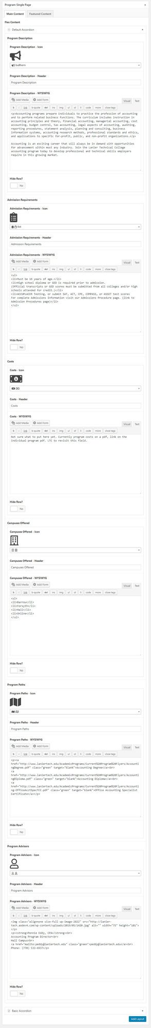
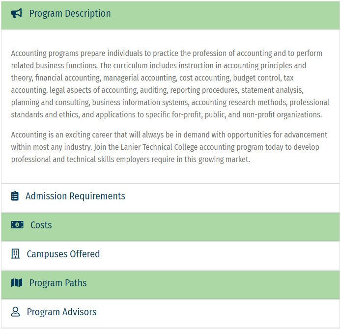
I. Default Accordion
What is it?
Auto-populates the first 6 accordion rows with icon image and header text for the following categories:
- Program Description
- Admission Requirements
- Costs
- Campuses Offered
- Program Paths
How to use it
Using the default accordion is similar to the programs accordion, in that it has section names, icons, and descriptions. Description text areas allow HTML markup. There are options to hide a row if it is not needed.
Where can it be used?
In the Program Single Page template, under the Main Content tab.
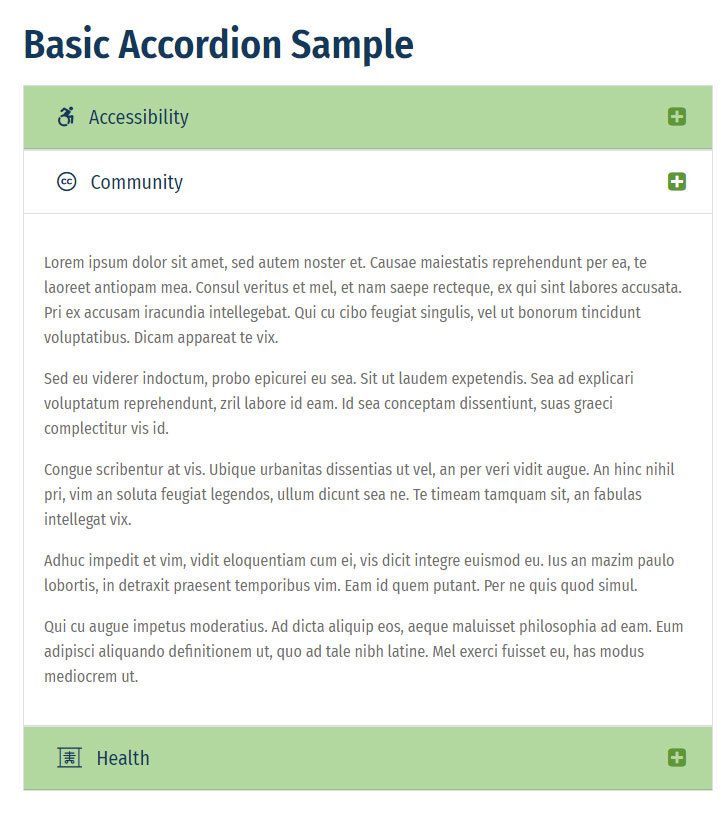
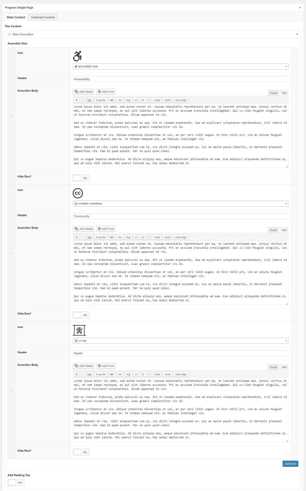
J. Basic Accordion
What is it?
Used to extend the default accordion. Add unlimited rows and customize icon, header text and description text. There is also an option to hide a row and to separate the accordion from the default accordion by using the “Add Padding Top” button.
How to use it
Using the basic accordion is similar to the programs and default accordion, in that it has section names, icons, and descriptions. Description text areas allow HTML markup. There are options to hide a row if it is not needed. Unlimited rows can be added.
Where can it be used? In the Program Single Page template, under the Main Content tab.
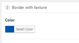
K. Border with Texture
What is it?
Accent element, blue horizontal line with diagonal green stripes. Used to visually separate major blocks of information with dark backgrounds.
How to use it
Add the border with texture section to the top of any section that needs to be visually separated from other content.
Where can it be used?
Home Page.

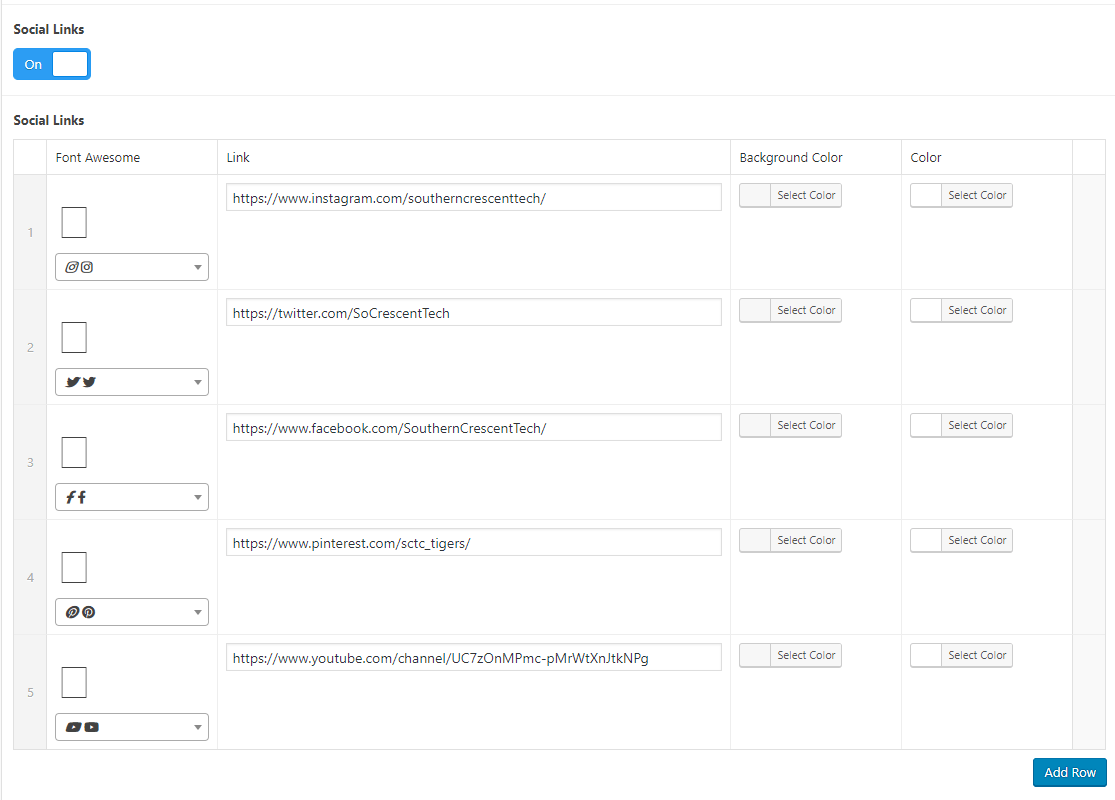
L. Campus Locations
What is it?
A section header with 5 column blocks containing campus name, address, learn more link, and a directions link.
How to use it
Add the name, address, learn more link, and directions link to the available fields in the Campus Locations layout. To add more columns (up to five), select "Add Row."
Where can it be used?
On the Default Template, Home Page.
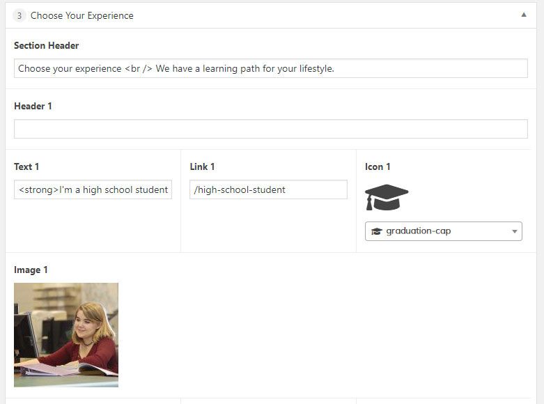
M. Choose Your Experience
What is it?
5 card section header with icons on top, short description, and button. Though this specific layout is limited to 5 cards, other templates allow for unlimited card options.
How to use it
To use, add the desired text and markup (if necessary) and link to the corresponding "Text" and "Link" sections. Each subsequent section will have corresponding fields labelled with numbers up to 5. Then, select an icon from the Font Awesome dropdown menu. There is also an option to select a header, which will add a larger font description with a horizontal rule beneath. It's best to keep this header simple to avoid visually overcrowding the element.
Where can it be used?
Default template, Choose Your Experience section
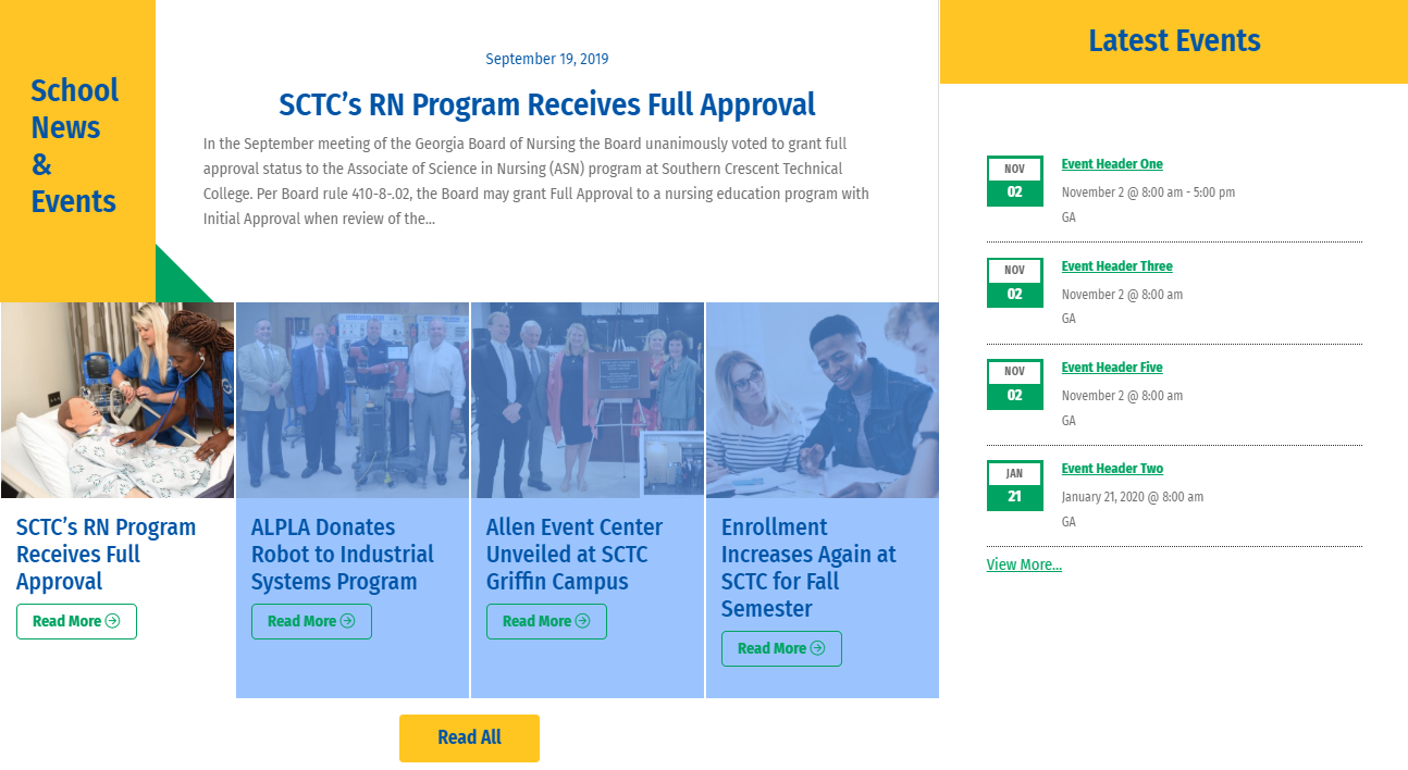
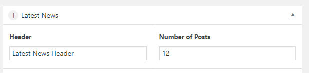
N. Latest News Styled
What is it?
Section header with a news feed of the latest articles posted. This layout is intended to be used on the home page only.
How to use it
The Latest News Styled layout has the option to customize a header and select how many posts you'd like to display.
Where can it be used?
Home Page.
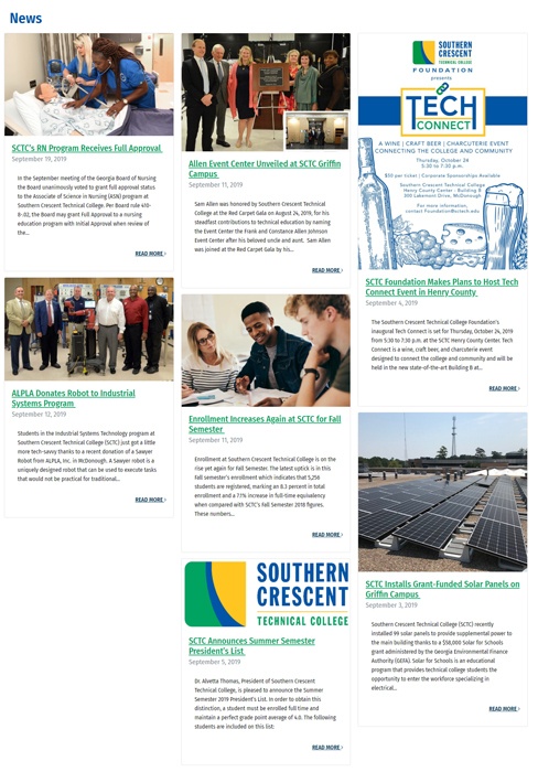
O. Latest News / Featured News
Latest News
What is it?
Latest News is a page that features snippets of latest news posts, displayed as cards with featured image, post title, date, excerpt, and Read More link.
How to use it
Add the Latest News layout to a page using the Default Template. The page header and post number are all that are needed for the layout. The rest is populated from the Posts section in the WordPress backend (see below) .
Where can it be used?
Home Page.
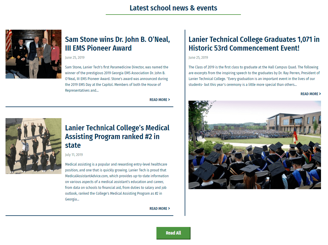
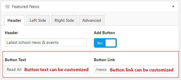
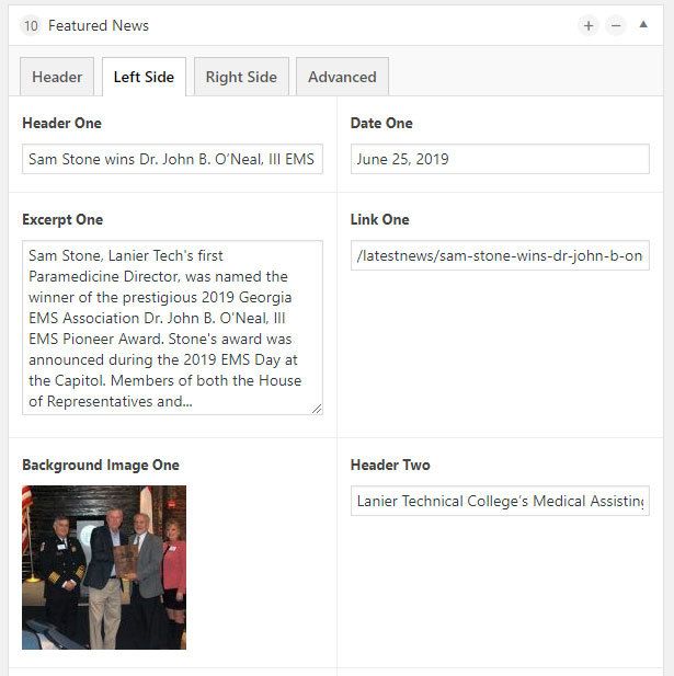
Featured News
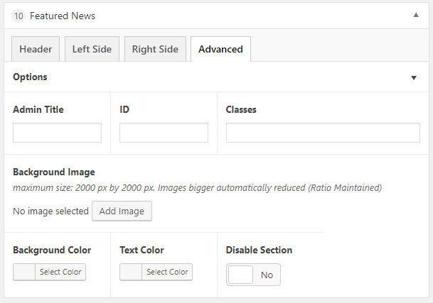
What is it?
Section header three content block layout, each with 3 featured blocks: image, header, date, description, link, and a section button at the bottom that leads to the news layout page.
How to use it
The Featured News backend layout has four tabs:
- Header: Add the section header for the individual block
- Left Side Content: Features two sections with header, date, excerpt, link, and background image, each numbered respectively (Header One, Header Two, etc.)
- Right Side Content: Third section featuring the Header Three, Date Three, Excerpt Three, Link Three, and Background Image Three fields
- Advanced (options): Section to adjust options, add section name, background image, color, text color, or disable section
Where can it be used?
Default Page template (Home Page)

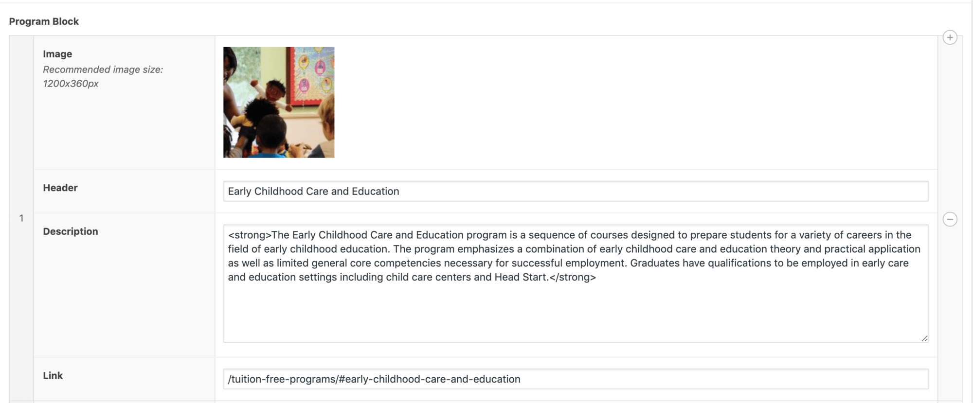
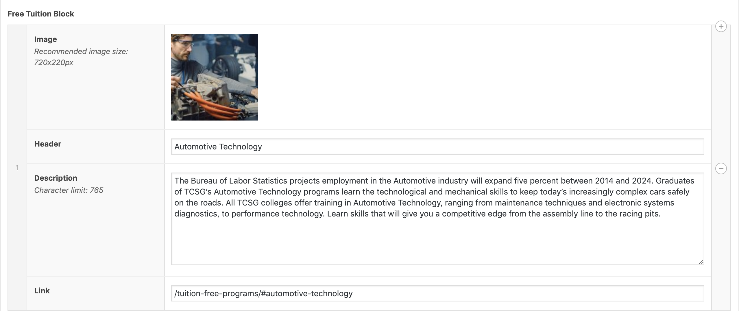
P. Free Tuition Programs Section
What is it?
Program blocks (image, header, preview description, link) and a display of more information. Add unlimited amount of programs.
How to use it
Only 6 programs will show at any time. HTML markup may be added to all text fields in the section. Each section will require an image to be selected for the element to display as expected. Choose to randomize the order on page load or drag and drop program blocks into a certain order and turn off the randomizer.
Where can it be used?
Home Page

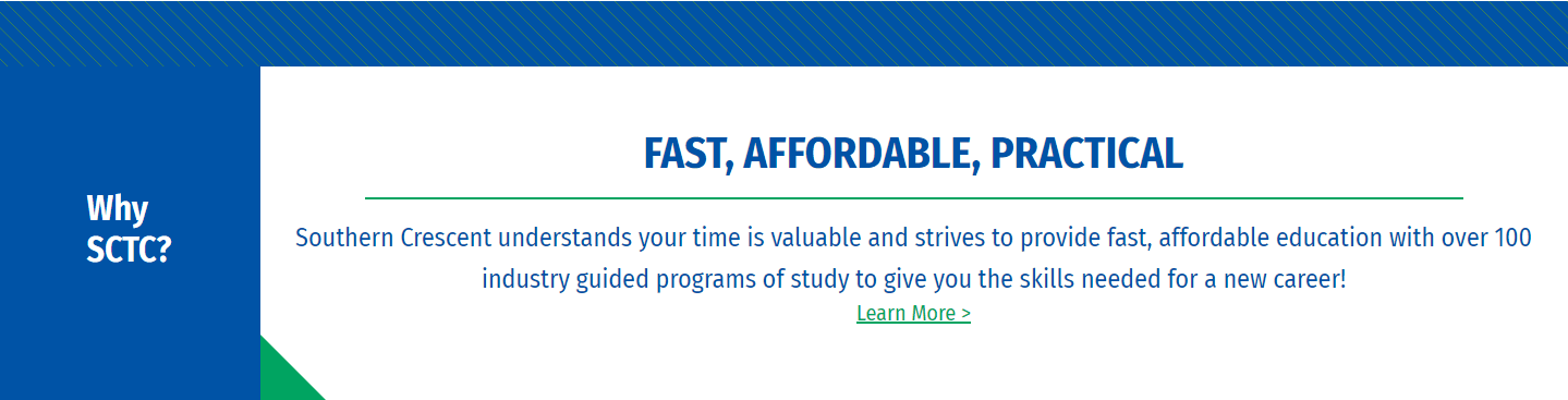
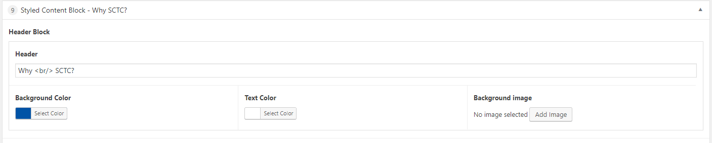
Q. Styled Content Block
What is it?
Header displayed in a blue box on the left, description displayed to the right with the green accent triangle in the corner. Allows important content to be visually set aside to draw attention.
How to use it
This block contains a Header, Content, and Advanced (Options) section. The header is a text field that allows HTML markup, and the content section is a Wysiwyg editor with rich or plain text options.
- Header: Add background color or image, and text color.
- Content: Add the content to be visually set aside.
- Advanced (Options): Provide optional admin title, ID, class, extra background image, color, or text size. Option to disable.
Where can it be used?
Home page template.
R. Program Cards
What is it?
This is a 3 column card layout which displays like a grid. It features a background image with a blue filter, header and icon overlay, which on hover will remove the filter to reveal the colored background image and a container with the header, a brief description and an auto-generated Learn More button.
How to use it
After selecting the Program Cards layout there will be a button to add a card. Click add card and fill out the required fields (header, description, background image, icon, link).
Where can it be used?
Featured Program Template

WordPress #
How to work with Posts
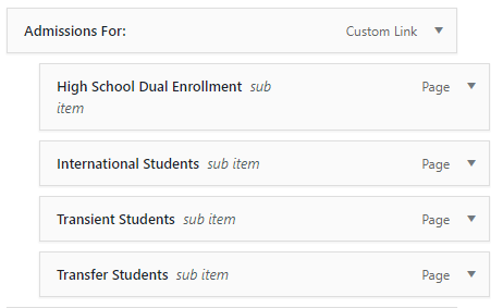
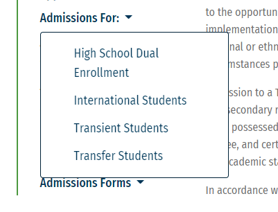
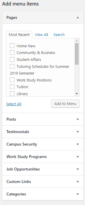
Menus


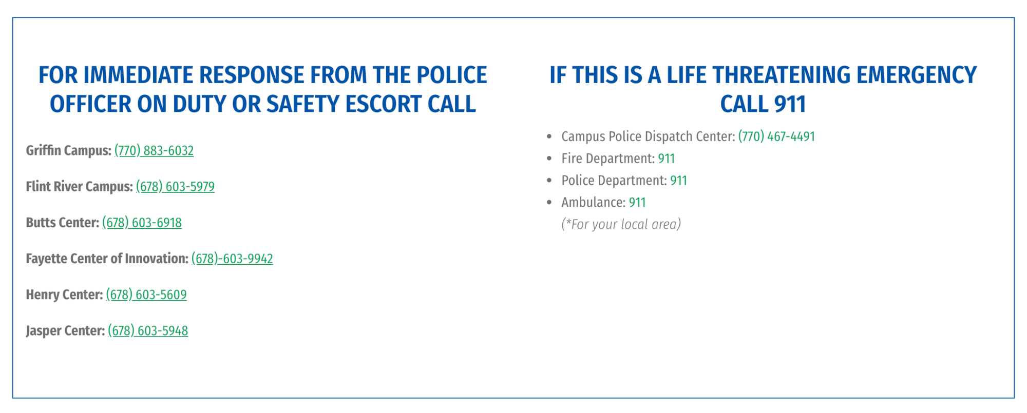
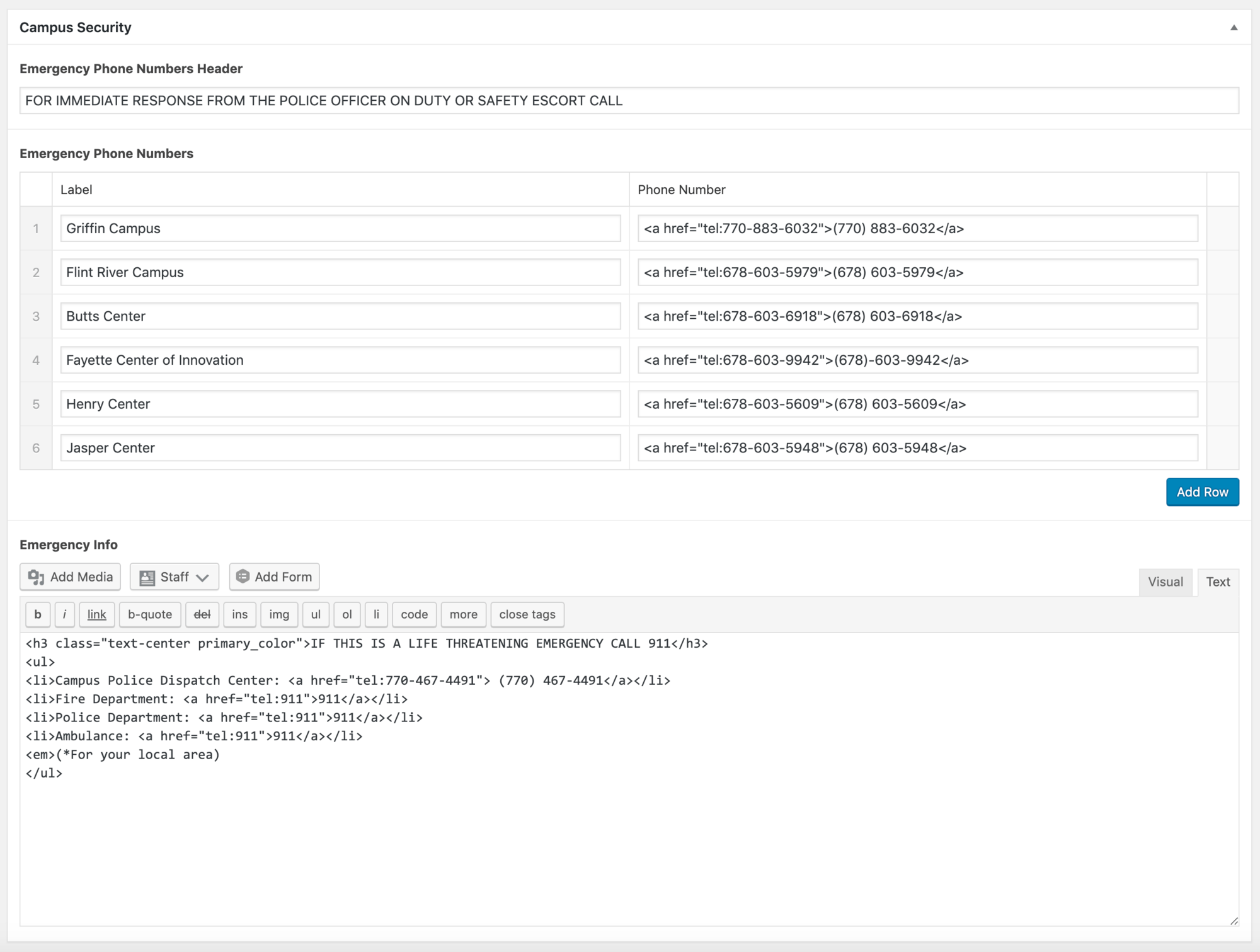
The [campus_security] shortcode can be placed in an HTML block. Note: because this is a custom shortcode, placing it in a content block will not work.
Campus Security
The [campus_security] shortcode can be placed anywhere in the site where the information would be pertinent. To edit, navigate to Campus Security > All Campus Security > Emergency Information. Here you'll be able to add emergency phone numbers and info as needed. Updating the information in the Campus Security backend automatically updates the front end wherever the shortcode is placed.
Plugins
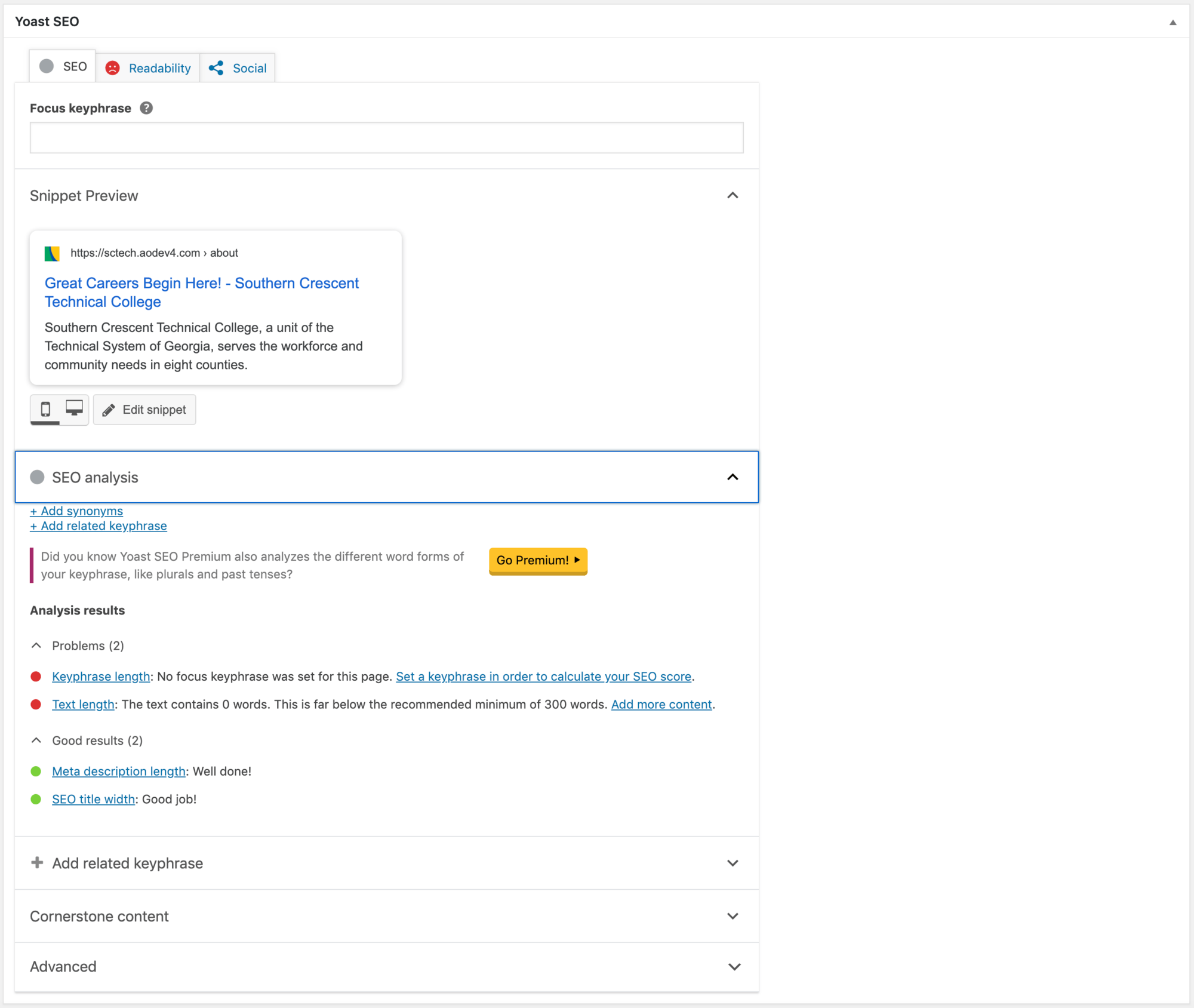
Yoast
Yoast is an SEO feature provided on each page on the backend. It gives a preview for search results, as well as provides readability scores to help streamline search engine optimization.
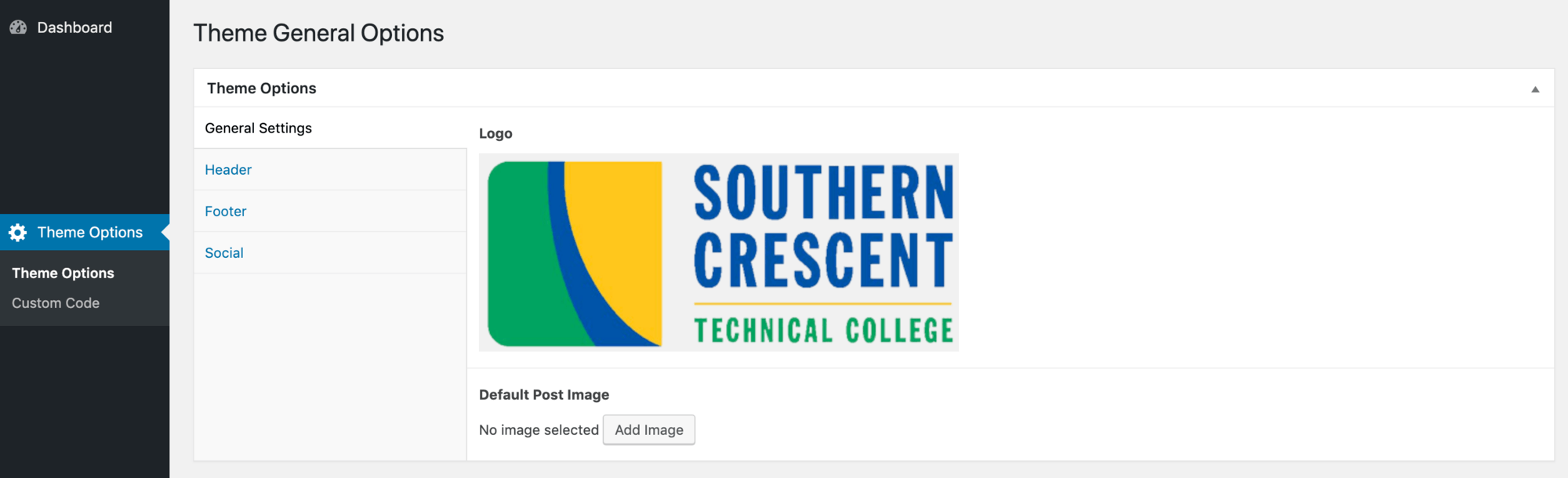
Theme Options
General Settings
Custom Code
Navigation (Appearance > Menus)
Here you will find all the main and secondary nav menus on the site. Select a menu to edit from the dropdown menu at the top to select the menu to edit.

Bootstrap Tutorial #
Bootstrap is the most popular CSS framework for developing responsive, mobile-first websites. Bootstrap 4 is the newest version, and includes seamless JavaScript integration to build interactive elements, such as accordions and tabbed navigation. It also uses Flexbox to reduce the need for complicated media queries and build grid-based layouts with ease.
Among such utilities as Colors, Display, Spacing, and Typography, Bootstrap provides accessibility frameworks to help your site with standards and best practice requirements. For more information on how Bootstrap's Accessibility is utilized, see Bootstrap's Accessibility Features.
Grid layout and using .row and .col-* classes
Bootstrap's mobile-first flexbox grid is used to build layouts of all shapes and sizes thanks to a twelve column system, five default responsive tiers, and dozens of predefined classes. Our Base Theme makes extensive use of the row and col class framework to construct responsive and customizable layouts.
How it works
The grid system uses a series of containers, rows, and columns to lay out and align content. It's built with flexbox and is fully responsive (for more information on how flexbox works, see A Complete Guide to Flexbox, and Basic Concepts of Flexbox). Below is an example and in-depth look at how the grid comes together.
  <div class="container-fluid">
    <div class="row">
      <div class="col-sm">
        One of three columns
      </div>
      <div class="col-sm">
        Two of three columns
      </div>
      <div class="col-sm">
        Three of three columns
      </div>
    </div>
  </div>
Note: It's important to include the .container-fluid class parent for the .row and its child elements to be properly aligned with the rest of the page. See the Container-fluid Example at the top of this page for more information.
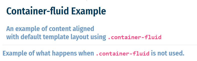
Illustration of content aligning with a default template H1 element page title by using .container-fluid
The above example creates three equal-width columns on small, medium, large, and extra large devices using Bootstrap's predefined grid classes.
Here's how the system works:
-
Rows are wrappers for columns, each column having horizontal
padding(known as a gutter) for controlling the space between them. Note: In a grid layout, content must be placed within columns, and only columns may be immediate children of rows. Think of the.rowclass as being like a bookshelf, where.col-classes are books. Without the shelf, the books would be scattered and unorganized, much like the layout and code if the parent.rowclass isn't first used. -
Thanks to flexbox, grid columns without a specified
widthwill automatically lay out as equal-width columns. For example, four instances of.col-smwill each automatically be 25% wide from mobile device sizes and up. -
Column classes indicate the number of columns to use out of the possible 12 per row. So, if you want three equal-width columns across, you can use
.col-4. Similarly, you could mix and match column classes to equal out 12 columns or fewer, i.e..col-8and.col-4, or.col-5and.col-6. - Column widths are set in percentages, so they're always fluid and sized relative to their parent element.
-
Columns have horizontal padding to create the gutters between individual columns, but you can remove the
marginfrom the rows andpaddingfrom columns with the class.no-gutterson the.rowparent. - To make the grid responsive, there are five grid breakpoints, one for each responsive breakpoint: all breakpoints (extra small), small, medium, large, and extra large.*
*Breakpoints: Bootstrap uses breakpoints based on minimum viewport widths that allow elements to scale up as the viewport changes and are called with class modifiers. These breakpoint modifiers are appended to positioning and grid classes (such as margin and padding and col classes) and are defined as xs (extra small), sm (small), md (medium), lg (large), and xl (extra large). Leaving off a breakpoint modifier is a good way to take advantage of Bootstrap's CSS library mobile-first principles, and can be used in place of the xs modifier. Several modifiers can be used at once to dictate an elements behavior across devices.
For example, the breakpoint modifiers in the following code will display the h2 element in a width spanning twelve columns in all mobile devices up until the md modifier is fired at a minimum device width of 991.98 pixels, where the width will span only three columns. Using class modifiers in this fashion will greatly reduce the need for media queries, providing an eloquent and user-friendly way to control the behavior of content on a website.
  <div class="row">
    <div class="col-12 col-md-3">
      <h2>Breakpoint Modifiers</h2>
    </div>
  </div>
For more information on the Bootstrap grid system, see this Bootstrap Grid Article.
Resize the browser window to see the mobile-first grid class modifiers in action.
Resize the browser window to see the mobile-first grid class modifiers in action.
Resize the browser window to see the mobile-first grid class modifiers in action.
Grid Options
|
Extra small <576px |
Small ≥576px |
Medium ≥768px |
Large ≥992px |
Extra large ≥1200px |
|
|---|---|---|---|---|---|
| Max container width | None (auto) | 540px | 720px | 960px | 1140px |
| Class prefix | .col- |
.col-sm- |
.col-md- |
.col-lg- |
.col-xl- |
| # of columns | 12 | ||||
| Gutter width | 30px (15px on each side of a column) | ||||
| Nestable | Yes | ||||
| Column ordering | Yes | ||||
Margin and padding classes can be similarly modified, as outlined in the Bootstrap Spacing Utilities section of the Lanier Styleguide.